| Availability: |
In stock
(2)
|
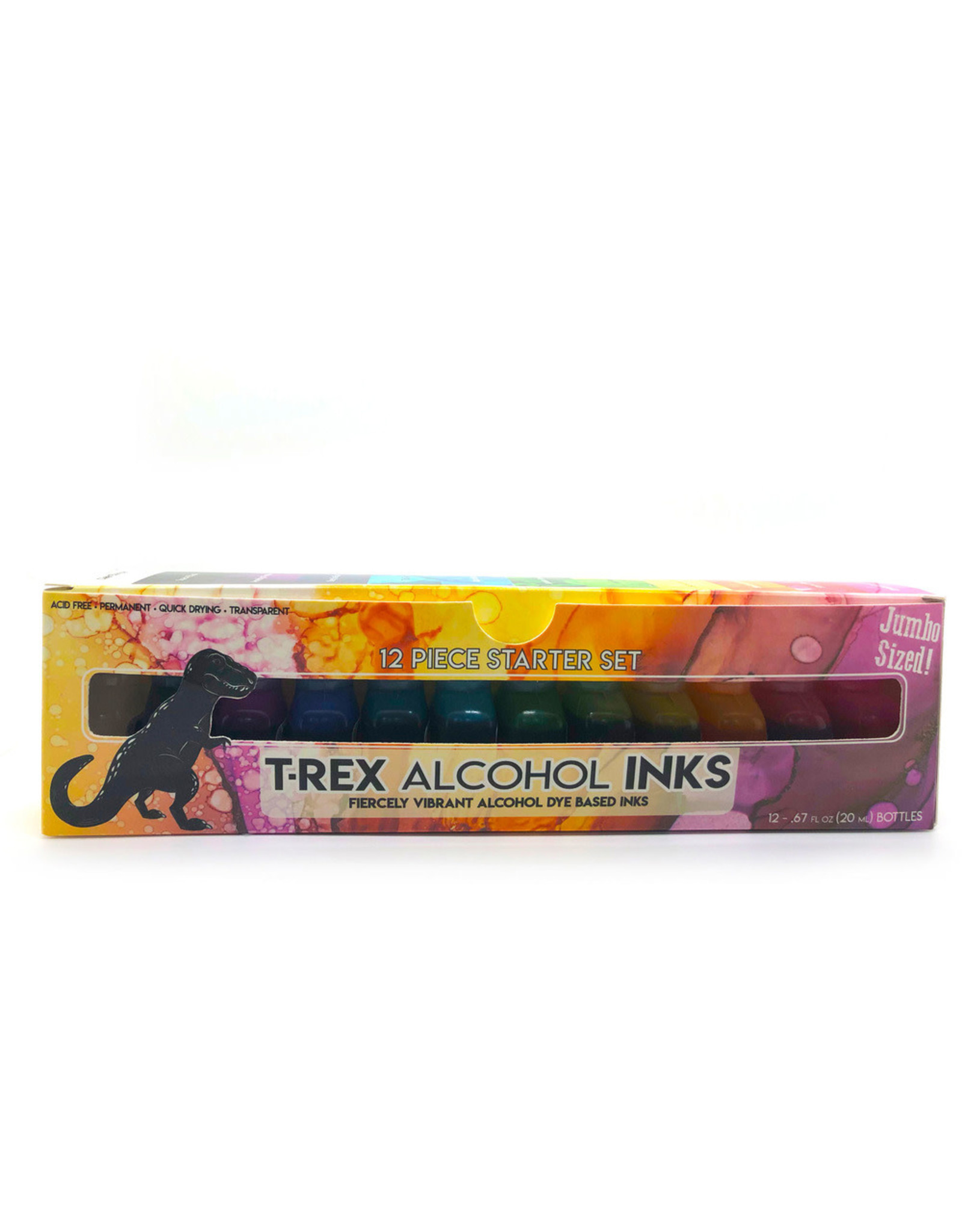
Includes 12 20ml bottles.
Fiercely vibrant premium alcohol ink starter set for artists with clear blender and box.
- JUMBO-SIZED: 12 Jumbo 20ml Alcohol Ink bottles providing 33-50% more ink per bottle than many brands
- REUSABLE STORAGE CASE: Keeps your inks organized and portable
- QUICK-DRYING & INDELIBLE: Our Alcohol Ink sets are water-resistant, 100% acid-free and Japanese dye-based for creating long lasting depth, layering & stunning effects
- ANTI-CLOGGING & LEAK-RESISTANT: Precision applicators & leak-resistant screw caps means more control, with less clogging and accidental spills
- HIGHLY SATURATED & FIERCELY VIBRANT: A perfect Alcohol Ink starter variety pack for Alcohol Ink painting, resin coloring, resin art & more!
- INCREDIBLY VERSATILE: Create brilliant color on most non-porous surfaces and as colorant for epoxy resin
Our inks clean up with alcohol, have rewetting properties, and can be thinned for transparency. Try it out on glossy paper, glass, stone, leather, ceramic, vinyl, plastic, foil, wood, fiberglass, vellum, epoxy resin, or even polymer clay. Our specially engineered precision applicator tips allow for controlled application.
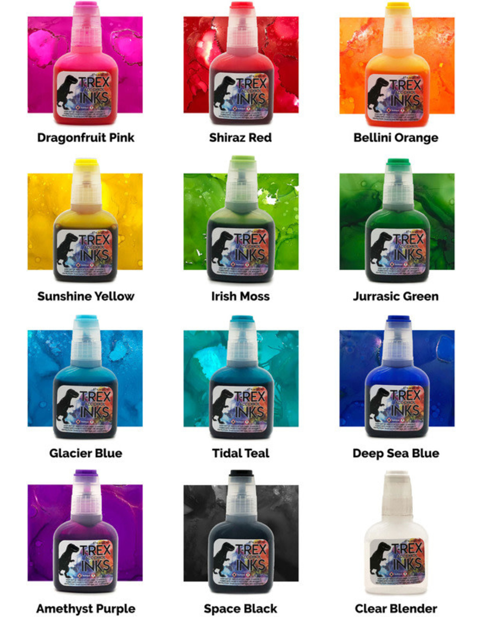
COLORS: Dragonfruit Pink, Shiraz Red, Bellini Orange, Sunshine Yellow, Irish Moss, Jurassic Green, Glacier Blue, Tidal Teal, Deep Sea Blue, Amethyst Purple, Space Black, Clear Blender.
ABOUT EACH COLOR
As artists ourselves, we put a lot of thought into these. Here is a little about each color we developed.
- DRAGONFRUIT PINK, the first color in the T-Rex Alcohol Ink Starter Pack! As an artist myself, Pink is always a tricky one to pin down. It can go so many directions, too red, too yellow, or it can be overly pigmented or even worse, so weakly pigmented that you can barely see it on the paper. So we tried out many variations and settled on this one. One look at it and we knew only one name would fit: Dragonfruit Pink. It is nearly exactly the color of the otherworldly sassy dinosaur looking fruit.
- SHIRAZ RED, Naming this one was a heated debate amongst friends and family about which kind of wine best suits this color. We learned that people have oddly strong opinions about wine and Shiraz won out. In my experience as an artist, often reds can be deceiving. They can look neutral, being neither too pink or too brown, but once it is on the page... Surprise! So we tested a few blends of red that looked almost identical to each other, but when their true colors came out once we saw them in action. Shiraz Red is neither too pinky, nor too purple. It is a solid, direct, and bold red you can count on.
- BELLINI ORANGE, Bellini Orange is an exquisite bright orange that is neither pinky nor browny, rather it is a vibrant and juicy orange. As it thins, it stays true to color, getting softer and more delicate but not color shifting. As for the name, who doesn't love a refreshing Bellini? Being that we are ALCOHOL inks, we decided to have a little fun with Shiraz Red and Bellini Orange in naming it after drinks, but that's it, we controlled ourselves past these two names. I remember the first time I had a Bellini at 21 in the Venetian in Vegas. It was such a fun soft color and the taste was just as juicy and bright.
- SUNSHINE YELLOW. This couldn't be more aptly named because the shade of yellow that comes out on the page is like warm sunlight on a fall day coming through the trees. Yellow can be a very tricky color to do right in art supply. Many yellows skew wayyyy to green, which is not what most artists want when they reach for a warm color. That being said, we also don't want an overly brown yellow or like some I have used, one that is basically a light orange. This is a true warm yellow. I love how it thins with the clear blender too. It is soft yet vibrant.
- IRISH MOSS, This green is my personal favorite of the bunch. It is so unique and captivating. As the color palette transitions from warm to cool colors, Irish Moss sits in the middle of the bunch, being a touch of both. It is green, but a warm green with a touch of yellow at its heart. Think of moss on a rock in Ireland, that super vibrant color that cameras never quite capture. Having a slightly warm green in your arsenal is an absolute must.
- JURASSIC GREEN is a deeply saturated cool-toned green that roars to life. As an ode to our moniker T-Rex we named it after the lush Jurassic age where green ruled supreme. A common problem with alcohol ink greens is that they get overly pigmented and end up looking clunky and nearly black on the page. Getting it just right was by far the hardest color of the batch but the pay off was so worth it. It is a true darker green.
- TIDAL TEAL, speaks of picturesque tidal pools, undulating waves, and tropical shores. We wanted this to be a deep and profound teal at its core, but when thinned, a soft and "tropical waters" green-blue. Many blends we tried didn't make the cut but this one was just perfect. So much of art with alcohol inks lends itself to oceanic tones so we knew we had to get this one just perfect. Nothing less would meet our standards. When we settled on this color we knew Tidal Teal was the right name because it made us smile and feel relaxed just thinking about being by the ocean.
- GLACIER BLUE, is such a pure and crisp blue that you can almost feel a chill looking at it. We were inspired by looking at glaciers on a trip to Alaska. We wanted to capture that beautiful blue on the edge of the glacier where the sunlight illuminates the ice. Glacier blue is a notch above sky blue in that it is more pigmented. As you use the clear blender to thin it, it can become a light sky blue too. Blues are so important to get right and we think we nailed this one quite well.
- DEEP SEA BLUE, is a resonant hue of blue that is probably our most saturated color. A little goes a long way with this blue. It is intense and intoxicating to work with. We formulated it to be a vivid blue that is neither navy nor so dark it looks black on the page, and also not purple or green in its base. That's a tall order to weed all that out, but the result is a sonorous blue that looks like the ocean deep. So naturally, Deep Sea Blue was a perfect fit.
- AMETHYST PURPLE, is a wonderfully jewel-toned purple hue that is remarkably vibrant. It leans towards the warmer sides of purples being royal in shade and striking in appearance. We tossed around a lot of names for this one but nothing hit the hue of the color like Amethyst did. We liked how the name Amethyst conveyed the richness of a gemstone and conjures up the memory of looking into its sparkling tones. Up until purple, in the starter pack, there have been 4 warm colors and 5 cool colors, so this warm leaning purple balances out the color palette with 5 warm-toned colors and 5 cool-toned colors for a well-balanced collection.
- SPACE BLACK. We are major nerds here at T-Rex and we love all things outer space. If "Outer Space Black" wasn't so wordy, we would have done that. As an artist, I often make nebula style paintings and having a solid black is extremely important to my work. I noticed with other brands that the base of their black was showing up green and brown and I did not like that. So we worked on getting the black as saturated and pure as possible. We wanted pure Vanta-black levels of darkness and we got it. Next up is the essential but massively underrated Clear Blender.
- CLEAR BLENDER. This is your tool to getting that wispy airy effect to your work, and thinning out colors for softer shades and looks. A drop of this will immediately thin and disperse your inks. Add in a little air movement from a bike pump or hairdryer and you will see some pretty neat things happen. To see how to get that airy flowy effect, check our art blog for a full instructional article. Alcohol inks can be rewetted even after they have been applied with this clear blender. That makes a painting with these inks a little less intimidating knowing you have some wiggle room to reapply.